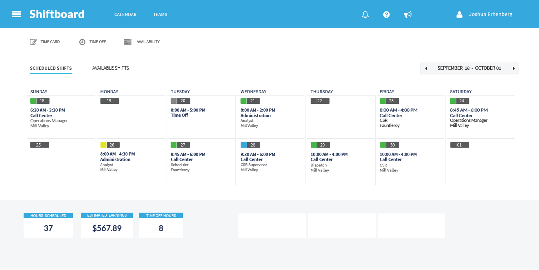
The redesigned interface introduced earnings visibility and modern visual design, addressing two critical user needs in one view.
Shiftboard UX Redesign: Modernizing a Legacy Platform to Secure Funding and Retain Key Customers
Drove investor interest and reduced support tickets by redesigning Shiftboard’s first major UX overhaul, preventing customer churn and positioning the platform for growth.
Context & Challenge
Shiftboard had grown through feature additions rather than intentional design. The founder and engineering team had built the product over time, resulting in a cluttered, outdated interface that frustrated users and put key contracts at risk.
The stakes were high: A new executive team was pushing for customer adoption and preparing for a funding round. Existing customers who had been vocal about the product’s shortcomings were considering leaving. Meanwhile, competitors with modern interfaces were winning new business.
The challenge: Modernize the platform’s look and feel, simplify core interactions, and prove to investors that Shiftboard could deliver product-led growth, all without alienating current users or disrupting operations.
My Role
Lead UX Designer, PM, and UX Researcher | 3-month project with ongoing iteration
I led the effort driving both strategy and execution across three critical dimensions:
Strategic Alignment
- Facilitated alignment across executive leadership, sales, support, and engineering
- Built and managed the customer advisory board, ensuring continuous user input
- Balanced strategic business goals (fundraising, retention) with user needs
Research & Design
- Conducted site visits to observe real-world usage and pain points
- Partnered with customer support and sales teams to identify friction points from both existing users and prospects
- Created streamlined designs focused on clarity and ease of use
- Tested prototypes with advisory board members and iterated based on feedback
Implementation Leadership
- Worked closely with engineering to ensure feasibility and smooth implementation
- Guided phased rollout to minimize disruption
- Monitored support tickets, user feedback, and satisfaction scores post-launch
Approach
Phase 1: Discovery & Alignment
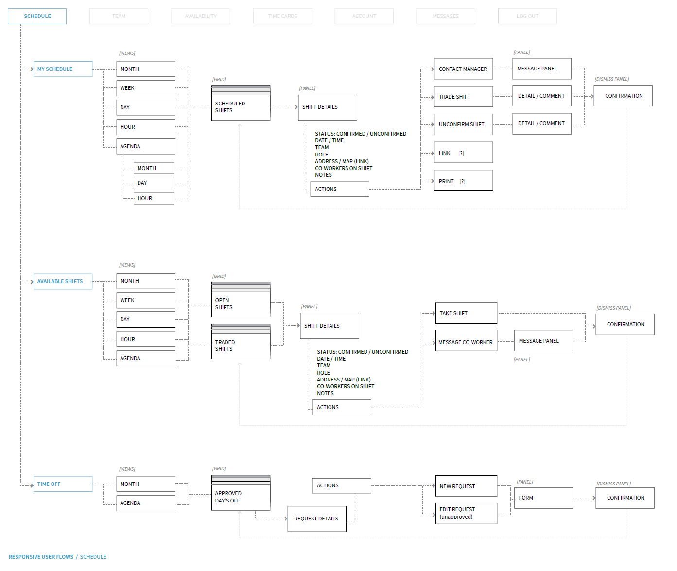
Mapped user flows for workers, supervisors, and administrators to identify the highest-impact areas for redesign.
I began by establishing a customer advisory board to gather direct feedback throughout the process. This ensured we weren’t designing in isolation—we had real users validating our direction at every step.
Through site visits and collaboration with customer support and sales teams, I identified friction points from multiple angles: existing users struggling with basic tasks, prospects comparing us to modern alternatives, and support teams drowning in tickets for workflows that should have been intuitive.
I prioritized three critical workflows that would deliver the most impact:
- Shift selection for workers
- Paycheck estimation
- Supervisor shift management
Phase 2: Design & Validation
Working closely with engineering, I created streamlined designs that balanced clarity with technical feasibility. Each design was tested with advisory board members, iterated based on their feedback, and refined to ensure both user satisfaction and smooth implementation.
Throughout this phase, I maintained alignment across stakeholders—executive team, support, sales, and engineering—ensuring everyone understood the vision and business case.
Phase 3: Launch & Iteration
I guided a phased rollout to minimize disruption, monitoring support tickets, user feedback, and satisfaction scores closely. Follow-up sessions with the advisory board allowed us to refine and optimize the experience based on real-world usage.
The Redesign Journey
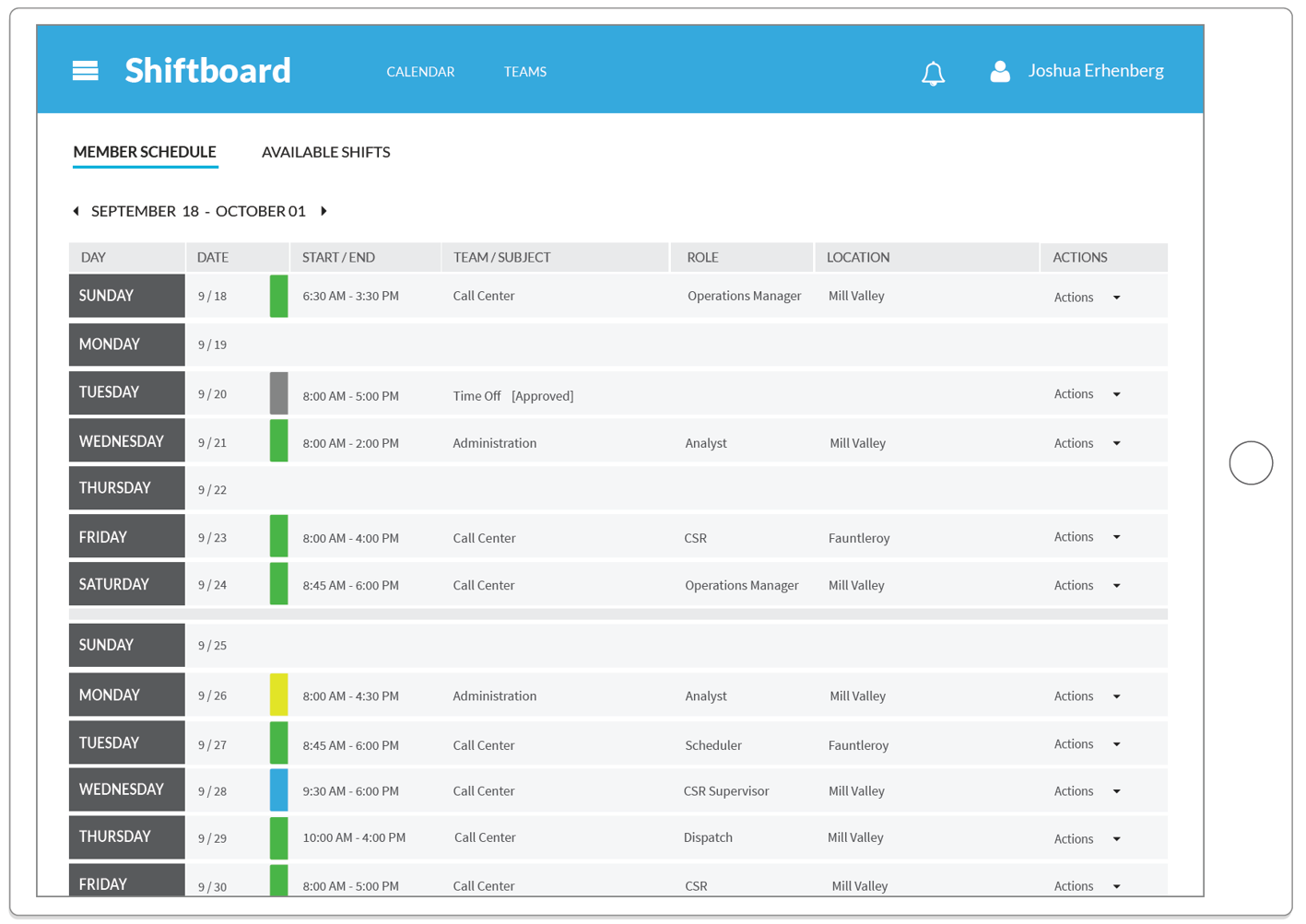
Worker Experience: From Confusion to Clarity
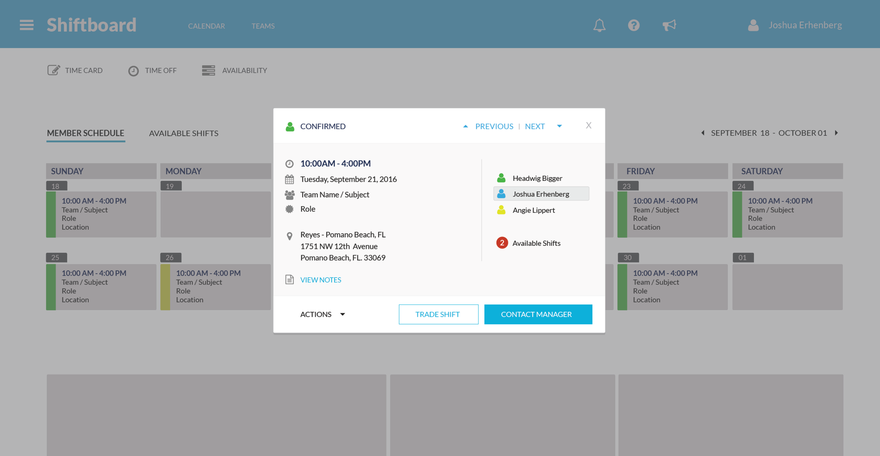
Workers gained clarity in shift selection and visibility into estimated earnings, transforming a frustrating process into an empowering one. The new design made it easy to see available shifts, understand compensation, and manage their time effectively.
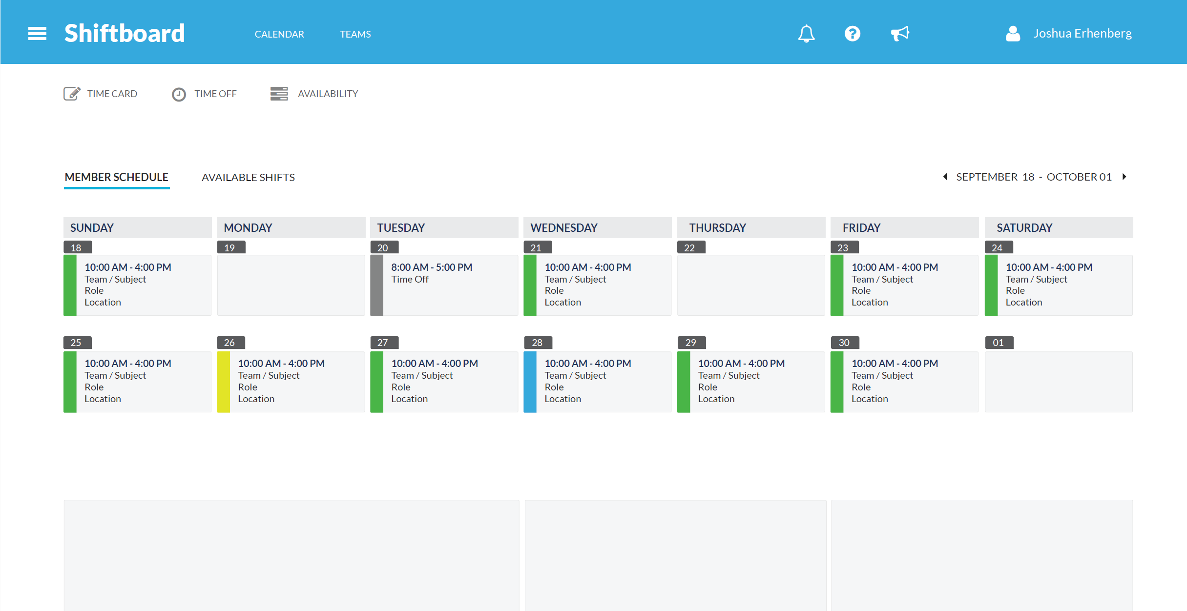
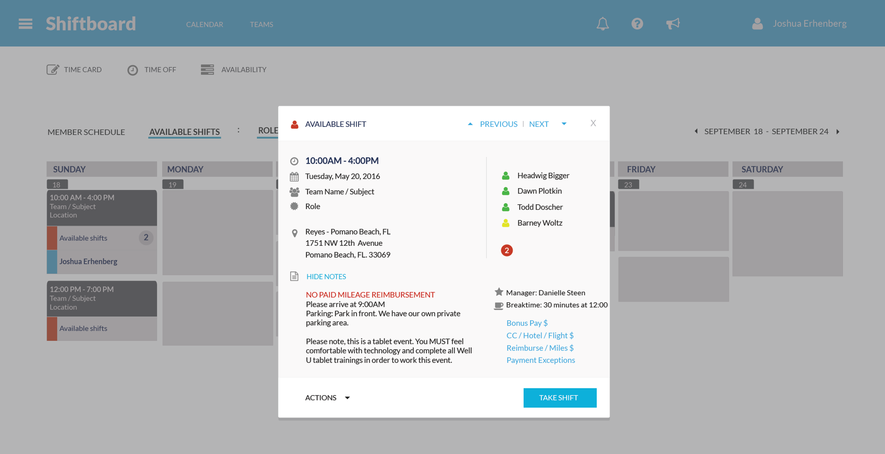
Clear calendar views, visible compensation details, and estimated earnings transformed shift selection from confusion to clarity.
Supervisor Experience: From Overwhelm to Control
Supervisors went from wrestling with complexity to efficiently managing teams. The redesigned interface reduced time spent on administrative tasks and made it easier to handle shift changes, contact workers, and manage availability.
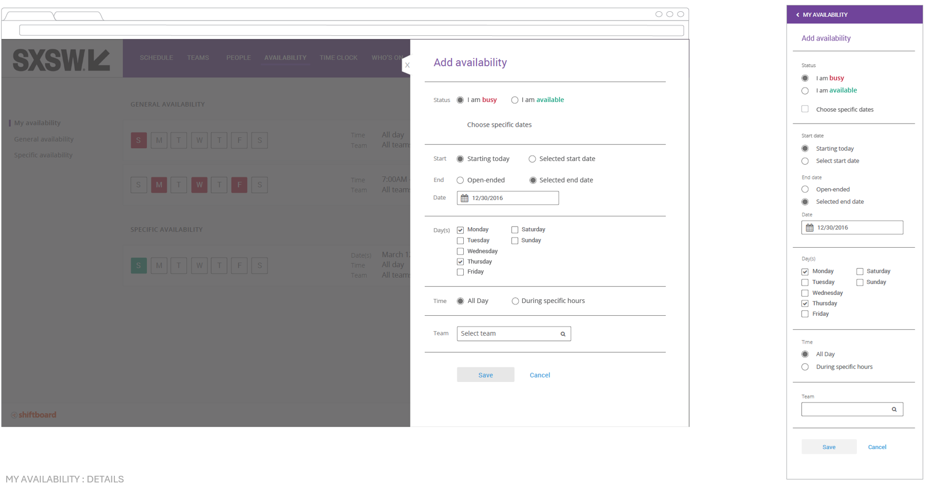
Streamlined interfaces for managing shifts, contacting workers, and handling availability gave supervisors back their time.
Responsive & Scalable Design
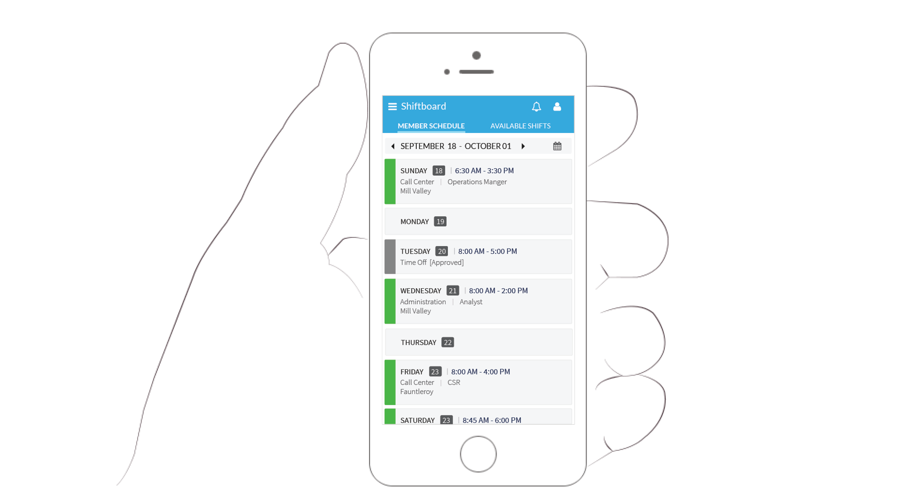
The redesign was built mobile-first, ensuring workers could manage their schedules from any device.
Results & Impact
Before: Outdated, bolt-on interface frustrating users, high support ticket volume for basic tasks, key customers threatening to leave, and difficulty competing against modern alternatives.
After: Reduced support tickets for core workflows, increased customer satisfaction scores and retention, reduced training time for new users, attracted investor interest contributing to successful fundraising, and improved sales positioning against competitors.
Real-World Impact
Major customers like SXSW implemented the redesigned platform, demonstrating the interface’s flexibility and appeal across different use cases.
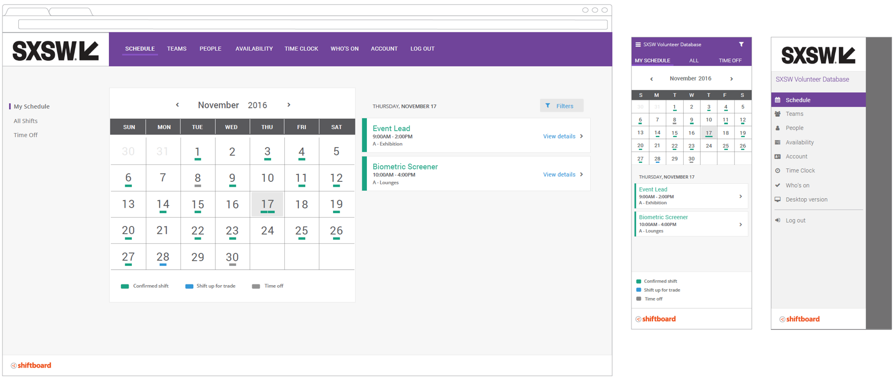
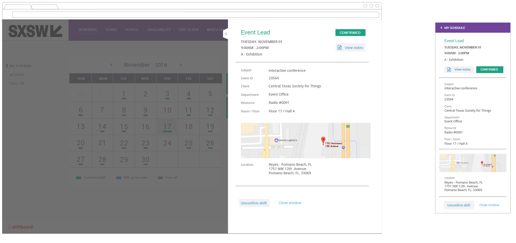
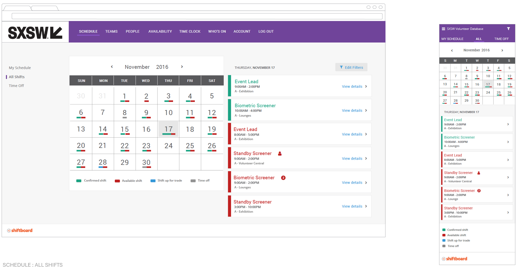
SXSW’s implementation showcased the platform’s ability to handle complex, multi-event scheduling at scale.
The redesign didn’t just improve the product—it validated the company’s growth trajectory and gave leadership confidence to pitch investors.
Why It Matters
This project demonstrated that strategic UX work directly drives business outcomes. By modernizing Shiftboard’s interface, we didn’t just make users happier—we protected revenue, enabled fundraising, and positioned the company for sustainable growth.
The work required balancing multiple perspectives: customers wanting simplicity, executives wanting investor appeal, and engineers managing technical constraints. Success came from bringing all stakeholders to the table early and maintaining alignment throughout.
Key Takeaway
When you involve customers early, align stakeholders around shared goals, and design with business impact in mind, UX becomes a growth engine, not just a polish layer.
This wasn’t about adding visual flair to an existing product. It was about understanding what was at stake—customer retention, competitive positioning, investor confidence—and using design as the strategic lever to address all three simultaneously.
Project Credits
Team: Engineering Team, Customer Advisory Board, Executive Leadership, Customer Support & Sales Teams
Duration: 3 months (with ongoing iteration)
My Role: Lead UX Designer, PM, and UX Researcher (Strategy, Research, Design, Stakeholder Management, Implementation Leadership)
Deliverables: Complete platform redesign, customer advisory board framework, mobile-responsive interface, improved core workflows (shift selection, paycheck estimation, supervisor management)